


Table of Contents
- Understanding Custom Sign Design Fundamentals
- Define Your Purpose and Target Audience
- Best Fonts for Custom Signs and Typography
- Signage Color Contrast Rules and Visual Impact
- Choosing Materials and Placement for Durability
- Custom Metal Sign Design Ideas That Stand Out
- Common Mistakes to Avoid in Sign Design
- Conclusion
Last Updated: August 25, 2026
Understanding Custom Sign Design Fundamentals
Custom sign design is the process of creating personalized, visually compelling signage that reflects your brand, personality, or message. Whether you're decorating a home bar, man cave, garage, or garden, the fundamentals remain the same: clarity, visual hierarchy, and durability. At Real Cool Signs, we offer aluminum signs that combine striking design with long-lasting materials.
The best signs aren't complicated. They're intentional. They communicate a single idea clearly, use contrasting colors and readable fonts, and are built to withstand the elements. A well-designed custom sign becomes a conversation starter, something people notice, remember, and talk about.
This guide walks you through the core principles of custom sign design, from choosing the right fonts and colors to understanding material durability and placement psychology. By the end, you'll have a practical framework for creating signs that actually work.
Define Your Purpose and Target Audience
Before you design anything, get clear on what the sign needs to do and who needs to see it. This single step prevents most design failures.
Ask yourself: Is this sign decorative, informational, or both? A sign in your man cave serves a different purpose than a garage sign that helps guests find your workshop. A pet-themed sign in a living room has different requirements than a weatherproof outdoor sign. Your audience matters too, are you designing for yourself, for guests, or for customers?

Define your sign's job. Does it need to grab attention from across a room, or will people read it up close? Will it live indoors or outdoors? Does it need to withstand rain, snow, and UV exposure, or just occasional dust? These constraints shape every design decision that follows.
Know who's looking. If you're decorating a home space, you're designing for people who'll see it regularly and for guests who'll see it once. That second audience matters. They form an impression in seconds. Your design needs to work in that timeframe.
Once you've answered these questions, you have a design brief. You know the constraints. You know the job. Now you can design with confidence instead of guessing.
Best Fonts for Custom Signs and Typography
Typography is where most beginner signs fall apart. The wrong font choice makes even a good idea look amateur. The right font choice elevates everything.
Choose fonts that prioritize readability over style. This is the rule that matters most. Decorative fonts are tempting, they're fun and unique. But if someone has to squint to read your sign, the design fails. For custom signs, readability wins every time.
Sans-serif fonts are your safest bet. Helvetica, Arial, Gotham, and similar typefaces are readable from a distance and work in almost any context (aiga.org). They're not boring, they're professional. They let your message shine instead of fighting for attention.
Serif fonts work for certain designs. If you're going for a vintage, rustic, or elegant aesthetic, serif fonts like Garamond or Georgia can work beautifully. The key is size and contrast. Serifs become hard to read at small sizes or low contrast, so use them strategically and make them large enough to breathe.
Limit yourself to two fonts maximum. One primary font for your main message, one secondary font for supporting text. Using three or more fonts creates visual chaos. Stick to two, make them different enough that they don't compete, and your sign will look intentional.
Font weight matters. Bold fonts command attention and work well for headlines and short messages. Light fonts feel elegant but can disappear at a distance. Medium weight is the safe middle ground. Test your chosen font at the actual size it will appear on your sign, what looks good on screen might not work in person.
Signage Color Contrast Rules and Visual Impact
Color is where your sign either pops or disappears. The rules here are simple but critical.
Contrast is everything. Your sign needs contrast between text and background. High contrast means dark text on light background, or light text on dark background. Low contrast, light gray text on white background, is invisible. If you can't read your sign from across the room, the color choice failed.
Test your color combinations in person. What looks good on a computer screen often looks different in natural light. Outdoor lighting, indoor lighting, and time of day all change how colors appear. If possible, print a sample or look at examples in similar lighting conditions before committing.
Limit your color palette. Two or three colors maximum. Your primary color (usually the background), your text color, and optionally an accent color for emphasis. More colors create visual clutter and dilute impact. Simplicity is strength here.
Warm colors grab attention; cool colors feel calm. Reds, oranges, and yellows are energetic and eye-catching. Blues, greens, and purples feel more subdued. Choose colors that match the mood you want your sign to create. A man cave sign might use bold reds and blacks. A garden sign might use greens and earth tones.
Avoid color combinations that don't work. Red and green together are hard on the eyes. Yellow and white have almost no contrast. Purple and blue blend together. If you're unsure, test it. Squint at your design, if the text disappears when you squint, your contrast is too low.
Consider your audience's age. Older eyes need more contrast and larger text. Younger audiences can handle more subtle color combinations. If your sign will be seen by mixed-age groups, default to high contrast and larger sizes.
Choosing Materials and Placement for Durability
Your design is only as good as the material it's printed on and where you put it. These choices determine whether your sign looks great for years or fades and deteriorates within months.
Aluminum is the gold standard for durability (astm.org). It resists rust, doesn't warp in humidity, and handles temperature swings without cracking. Real Cool Signs uses durable aluminum construction specifically because it outlasts wood, plastic, and cheaper metals. If you're investing in a custom sign, aluminum protects that investment.
Placement affects longevity. A sign in direct sunlight all day will fade faster than one in partial shade. A sign exposed to salt spray (near the ocean) needs more protection than one in a dry climate. A sign on a covered porch lasts longer than one in open weather. Choose your location first, then select materials that match those conditions.
UV protection matters for outdoor signs. If your sign will live outside, make sure the printing process includes UV-resistant inks or coatings (iso.org). This prevents fading from sun exposure. Many custom sign makers offer UV-protective finishes as standard, confirm this before ordering.
Indoor signs have fewer constraints. If your sign lives inside a climate-controlled space, you can prioritize aesthetics over weather resistance. Indoor signs can use a wider range of materials and finishes because they're not battling the elements.
Thickness and weight indicate quality. Thinner materials feel flimsy and cheap. Thicker materials (like the 0.32mm aluminum used in Real Cool Signs products) feel substantial and durable. When you hold a quality sign, you feel the difference.
Custom Metal Sign Design Ideas That Stand Out
The best custom metal sign designs follow principles, but they also have personality. Here are the types of designs that actually work and stand out.
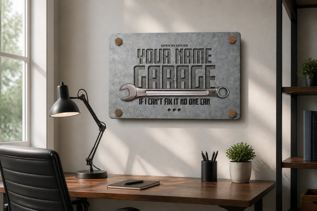
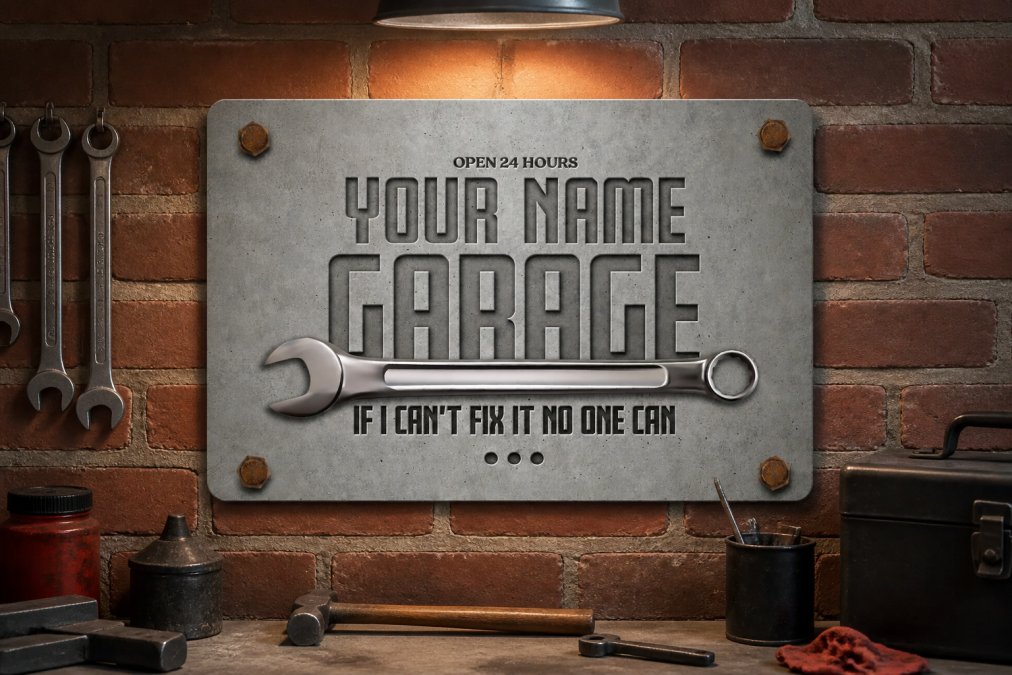
Personalized text-based designs are the most popular and most effective. Your name, a favorite quote, a hobby reference, text-based designs work because they're instantly personal. A Personalized Garage Sign with your name and a concrete-look finish transforms a workspace from generic to yours. The design is simple, the message is clear, and it works.
Theme-based designs connect to your interests. Car signs for automotive enthusiasts, pet signs for animal lovers, beer and bar signs for home entertainment spaces. The best theme designs don't try to be everything, they commit to one aesthetic and execute it well. A Personalized Beer Sign in a man cave works because it's specific, not generic.

Combination designs pair text with simple graphics. A garage sign might include a wrench icon. A garden sign might include a plant silhouette. Keep graphics simple and bold, intricate details get lost on metal signs. The graphic should reinforce your message, not compete with it.
Vintage and rustic styles feel timeless. Wood-look finishes, distressed effects, and retro fonts create nostalgia and warmth. These designs work especially well in garages, bars, and outdoor spaces. The key is authenticity, a design that feels genuinely vintage works better than one that tries too hard.
Minimalist designs are underrated. A single word, a clean font, a high-contrast color scheme. Minimalism forces you to be intentional about every element. The result is often more powerful than a busy design.
Color blocking uses solid areas of color to create visual interest. Two or three bold colors in geometric shapes can be more impactful than gradients or complex patterns. This technique works especially well on metal because the material's reflective quality enhances color impact.
Real Cool Signs' collection includes designs across all these categories. The Personalized Workshop Sign with its rustic wood look and humorous text is a perfect example of a design that stands out because it's specific, well-executed, and matches its audience perfectly.

Common Mistakes to Avoid in Sign Design
Learning what NOT to do saves you time and money. These are the mistakes that trip up beginners most often.
Mistake 1: Overcrowding the design. Beginners often try to fit too much text, too many graphics, and too many colors into one sign. The result is visual noise. Your eye doesn't know where to look. The message gets lost. The fix: delete something. If you're torn between two versions, the simpler one is almost always better.
Mistake 2: Choosing style over readability. A decorative font looks cool until someone can't read it. A trendy color combination looks interesting until it has no contrast. Readability is non-negotiable. Your sign's job is to communicate. If it fails at that, the design failed, no matter how beautiful it is.
Mistake 3: Ignoring your actual environment. A sign designed on a computer screen looks different in your actual space. Lighting, wall color, surrounding décor, these all affect how your sign looks. Before ordering, visualize your sign in context. Will it match or clash? Will it have enough contrast with the wall behind it? These questions matter.
Mistake 4: Underestimating size. Text that seems readable at actual size often looks too small in person. Signs need to be readable from the intended viewing distance. If people will read your sign from across a room, text needs to be larger than you think. If it's a close-up reading experience, smaller text works.
Mistake 5: Mixing too many design styles. Vintage text with modern graphics. Rustic finish with sleek typography. Mixing styles creates confusion. Commit to an aesthetic and follow it through. Consistency makes designs feel intentional and polished.
Mistake 6: Forgetting about maintenance. An outdoor sign needs cleaning and occasional touch-ups. A sign in a humid space might need protective coating. Plan for maintenance before you install. The best design fades if you don't protect it.
Mistake 7: Choosing materials based on price alone. Cheap materials look cheap. They fade faster, warp, rust, or deteriorate. Investing in quality materials like durable aluminum means your sign looks great for years, not months. Real Cool Signs' aluminum construction is built to last.
Conclusion
Custom sign design doesn't require a design degree. It requires clarity about your purpose, intentionality about your choices, and commitment to readability and durability. Start with a clear message, choose readable fonts and high-contrast colors, pick materials built to last, and think about where your sign will actually live.
The best signs are personal. They reflect who you are or what you care about. Whether you're decorating a man cave, personalizing a garage, or creating a gift for someone special, your custom sign should feel like an expression of your style.
Ready to make your space stand out? Explore unique, conversation-starting signs at RealCoolSigns.com and find the perfect piece for your home, office, garage, or gift.
Frequently Asked Questions
What are the basic principles of custom sign design?
Effective custom sign design rests on five core principles: clarity of message, visual hierarchy that guides the viewer's eye, readable typography at your intended viewing distance, sufficient color contrast for legibility, and alignment with your brand identity. Start by deciding what single message your sign should communicate, then organize elements so the most important information stands out first. These principles ensure your sign is both beautiful and functional.
How do I choose the best fonts for custom signs?
Select fonts based on readability and viewing distance. Sans-serif fonts (like Arial or Helvetica) work best for signs because they're clean and easy to read from far away. Avoid overly decorative or script fonts for body text, reserve those for headlines only. Pair one bold, simple font for your main message with a complementary secondary font for supporting details. Test your font choices at the distance where people will actually read your sign.
What are signage color contrast rules I should follow?
Use high-contrast color combinations to maximize readability. Dark text on a light background (or vice versa) creates the strongest contrast. Avoid pairing colors that are similar in brightness, like light gray text on white, or dark blue on black. Aim for at least a 4.5:1 contrast ratio between your text and background. Test your color choices in different lighting conditions, especially if your sign will be outdoors or in dim spaces.
Will aluminum signs fade or rust if placed outside year-round?
Quality aluminum signs are built to resist fading and rust. Aluminum naturally resists corrosion, and premium sublimation printing with UV protection locks colors in place, preventing fading from sun exposure. Real Cool Signs uses .32mm thick aluminum with UV-protected finishes, making signs durable for outdoor patios and year-round display. Occasional cleaning with mild soap and water keeps them looking fresh for years.
What materials work best for custom metal sign design ideas?
Aluminum is the top choice for custom metal signs because it's lightweight, durable, rust-resistant, and accepts vibrant printed designs beautifully. It works indoors and outdoors without requiring special maintenance. For custom metal sign design ideas, aluminum allows endless customization, from vintage garage aesthetics to modern personalized bar signs. The material's versatility makes it ideal for man caves, workshops, gardens, and home bars.
How do I know if my custom sign design will work before ordering?
Create a mockup using simple design software or even print your design at actual size and place it where your sign will hang. View it from different distances and lighting conditions. Check that text is readable, colors pop against the background, and the overall composition feels balanced. Ask yourself: Can I read this from 10 feet away? Does it match my space's style? If the answers are yes, you're ready to order.
Can I use custom signs in a rental apartment without damaging walls?
Yes. Use damage-free mounting options like adhesive strips, magnetic mounts, or removable hooks rated for your sign's weight. Aluminum signs are lightweight, so they work well with temporary mounting solutions. If your sign is small to medium-sized, adhesive strips or command hooks handle the job without leaving permanent marks. Check your lease for any restrictions on wall décor before installing.
Ready to make your space stand out? Explore unique, conversation-starting signs at RealCoolSigns.com and find the perfect piece for your home, office, garage, or gift.